You only retire once, and averages don't tell you what that one time looks like.
This plays your plan forward year by year, thousands of times, drawing each
year's return at random. What comes back is not a yes or a no but a
probability that your money lasts, plus a fan chart of how
wide the outcomes really are. It runs entirely in your browser, has no
backend, and nothing you type ever leaves your machine.
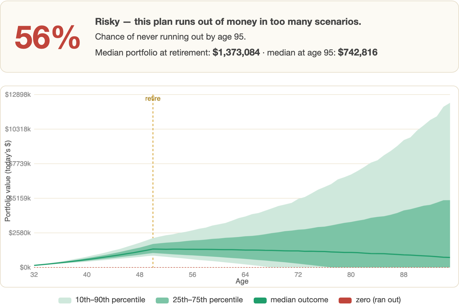
A real run: retire at 50 on $150k saved and $40k a year in, spending $60k.
56%. Not a plan you would want to bet on.
5,000
randomized market futures per run, each a full year-by-year path from
today to your plan-until age.
3% → 90%
what nine more years of work did to the same plan. The simulator
finds that crossing point for you.
0
bytes sent anywhere. No backend, no account, no dependencies — one
HTML file and a <canvas>.
Free
and open source. No upsell to a financial adviser at the end of it.
Start · why not a rule of thumb
Sequence of returns is the thing rules of thumb cannot see
The 4% rule and "25× expenses" both describe an average future. The trouble
is that a crash in your first three years of retirement is far more damaging
than the identical crash twenty years later, because you are selling assets
to live on while they are down and they never get the chance to recover.
An average return hides that entirely. Two futures with the same mean can end
with one person comfortable and the other broke at 74, purely on the order
the good and bad years arrived. Simulating thousands of orderings turns a
fragile yes-or-no into an honest probability.
↓ the demonstration
Nine years of work, 3% to 90%
The clearest way to show what the simulator is for is to run the same plan
three times, moving only the retirement age. Same savings, same
contributions, same spending, same assumptions.
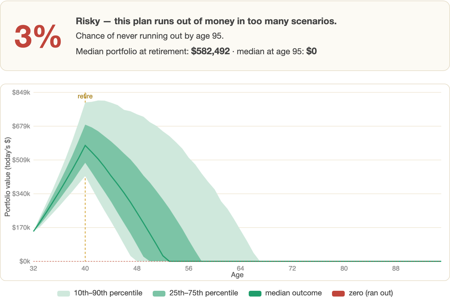
Retire at 40 → 3%. The median path hits zero in the
early fifties. Median portfolio at age 95: $0.
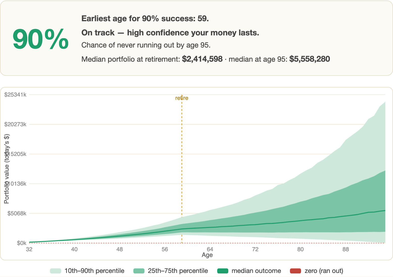
Retire at 59 → 90%. Found automatically by the
earliest-age search. Median at 95: $5,558,280.
Between those two sits the 50-year-old plan at the top of this page, at
56% — a coin flip dressed up as a retirement. That is
exactly the case a single-number rule of thumb would wave through, and the
case a probability makes impossible to ignore.
"Find earliest age for 90% success" searches the retirement ages for you,
so you get the answer to the question you actually had rather than the one
you knew how to ask.
The button that does the useful work
↓ reading the chart
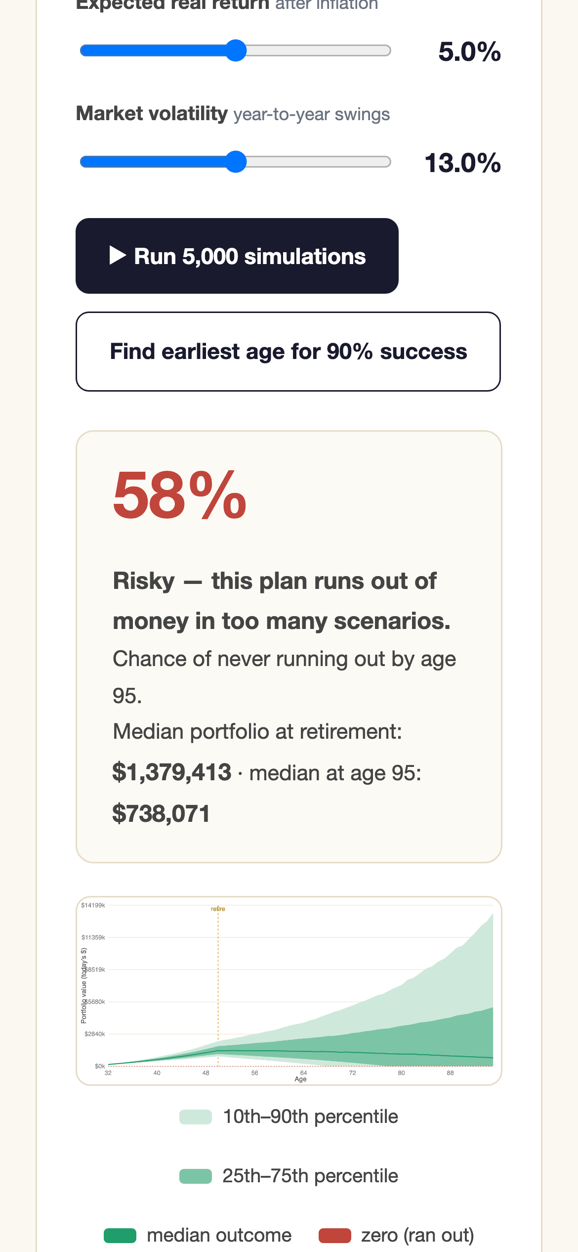
The bands matter more than the line
The dark line is the median outcome, and it is the least interesting thing on
the chart. The shaded bands are the 25th–75th and
10th–90th percentiles, and their width is the honest
picture: by the end of a long retirement the plausible outcomes span an order
of magnitude.
The red dashed line at zero is the one that decides the headline number. The
success rate is simply the share of the 5,000 paths that never touch it
before your plan-until age.
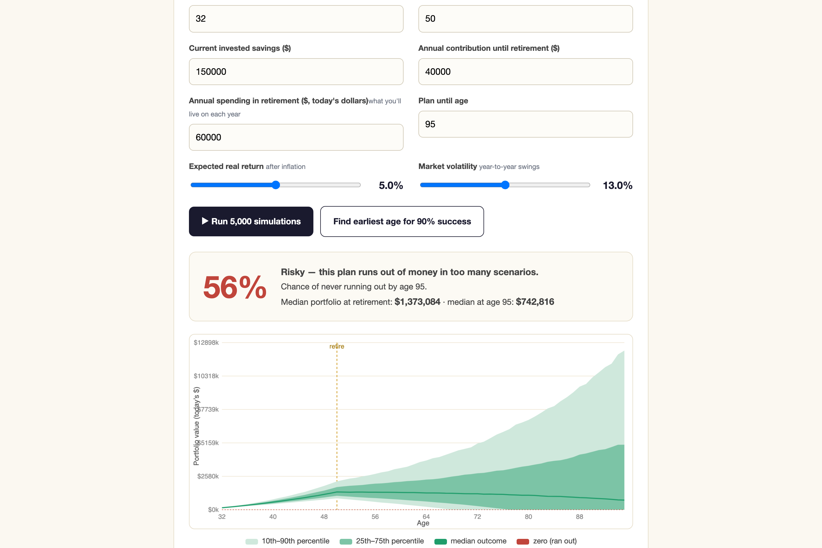
The whole app. Eight inputs, two buttons, one honest answer.
↓ on a phone
The same tool, one column
The layout collapses to a single column on a phone with the chart still
legible, because this is the sort of thing people actually work out on the
train rather than at a desk.
390px wide, nothing cut off.
↓ what this cannot tell you
A model of markets, not a forecast of them
Returns are drawn from a normal distribution around the average real return
and volatility you choose, using a Box–Muller transform. Real markets are not
normal: they have fatter tails and their bad years cluster together in a way
independent draws do not reproduce. A Monte-Carlo built this way tends to be
slightly optimistic about the worst cases.
It also models a single portfolio with a constant real return and constant
real spending. No glide path, no taxes, no pension, no lumpy costs, no
spending less in a bad year — which is the most important missing behaviour,
because real retirees do adjust and that flexibility is worth a lot of
success rate.
Treat the output as a way to compare plans against each other, not as a
prediction about your life. This is an educational tool, not
financial advice.
Finish · what it is built on
One file, no dependencies
The whole thing is a single HTML file with vanilla JavaScript. There is no
framework, no build step, no backend and no analytics. You can read the
entire simulation in one sitting, which for a tool making claims about your
retirement seems like the right property to have.
Simulation
Year-by-year: contributions until retirement, then withdrawals, each year's return drawn at random
Return draw
Box–Muller normal around your chosen real return and volatility
Success rate
The share of paths that never hit zero before your plan-until age
Earliest-age search
Re-runs the simulation across retirement ages to find the first that clears 90%
Chart
Drawn directly on a <canvas>, no charting library
Privacy
No backend and no network calls. Your numbers never leave the browser