Everyone who runs a marathon lands somewhere on the same line of human endurance, from a six-hour first-timer to the fastest performance ever recorded. We rarely see the whole line. This draws it, from the 31,842 finishers of the 2014 Boston Marathon, and asks exactly where the world record falls on it.
The shape of a field, and the GOAT off its edge
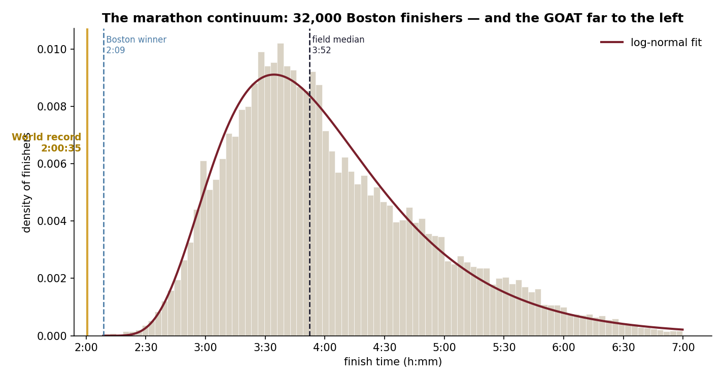
A marathon field is log-normal: a rising shoulder into a peak near 3:30–3:50, then a long tail past six hours. And then there's the record. Kiptum's 2:00:35 doesn't sit in the fast end of this distribution. It sits beyond it, a gold line to the left of every finisher, faster even than the Boston winner's 2:09. Against this field it is 2.4 standard deviations below the mean, and the median runner is 93% slower. Elite marathoners aren't the right tail of the amateur curve; they're their own species off its edge.
How far can the edge go? Extreme Value Theory
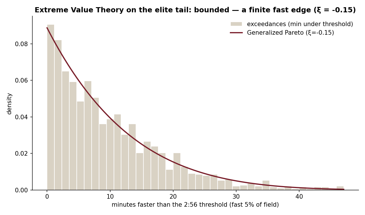
To describe the fast edge you can't use the body distribution. You use Extreme Value Theory. A Generalized Pareto fit to the fastest 5% returns a shape parameter ξ ≈ −0.15. The sign is the point: below zero means the tail is bounded. It runs into a wall rather than trailing off forever. The data can see the wall's shadow, even if (honestly) it can't pin its exact location.
Where do you land?
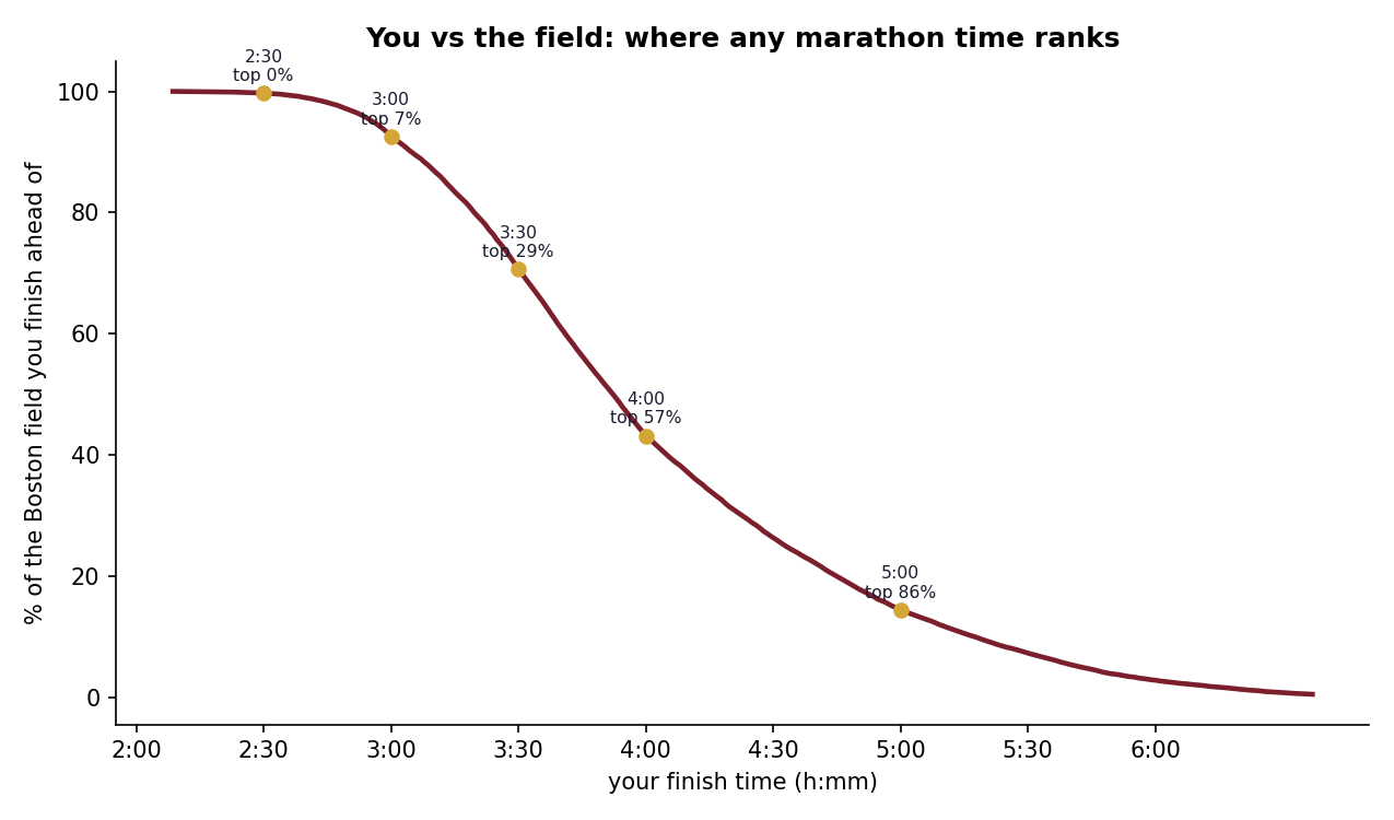
Give it a time, get your place on the continuum. A serious 3:00 beats about 93% of this already-fast field; 4:00 lands right at the median, and each is still half a world away from the record.
| Finish time | Beats this % of the field | Slower than the WR by |
|---|---|---|
| 2:30 | 99.7% | 24% |
| 3:00 | 92.6% | 49% |
| 3:30 | 70.6% | 74% |
| 4:00 | 43.2% | 99% |
| 5:00 | 14.4% | 149% |
A note on the data: Boston is a qualifying race, so this is the distribution of already-fast, committed runners, not the general public. Every figure here describes this field. A mass-participation race would shift the whole curve slower and make the record look more extreme still. Code & method on GitHub.