marathon-shoe-revolution-decomposition
 Hero photo: the lead pack mid-race. Credit: Wikimedia Commons, CC-BY-SA — see image credits at the end for source.
The fight that won’t end
If you spend any time around running people, you eventually watch the same argument play out.
Someone posts that Kelvin Kiptum ran 2:00:35. Someone else replies that it doesn’t count, the shoes did it. A third person counters that the shoes are only worth 1%, the rest is training. A fourth links to a 2019 paper that measured 4% running-economy improvement on a treadmill. Someone says yeah, but treadmills aren’t races. Someone says shoes aren’t doping. Someone says of course they are. Nobody ever lands the plane.
I had the same question myself, mostly because I’d been watching road marathon records fall at a pace that didn’t match anything in the sport’s history. World records had been improving roughly one second a year through the 1990s and 2000s. From 2017 to 2024 the men’s record dropped 111 seconds. Was that the shoe?
The honest answer is that nobody had really tried to bound the question with data instead of opinion. The biomechanics papers measured individual athletes on treadmills. The running press cited a 3–5× increase in sub-2:10 performances and said probably mostly shoes. The athletes themselves said various things depending on what they were sponsored to say. There wasn’t a number you could point at and say: this is what the shoe accounted for in the population.
So I sat down with the data.
What I was actually trying to answer
The question I wanted to answer is: of the total elite marathon time improvement between the pre-Vaporfly era (2010–2016) and the post-Vaporfly era (2018–2024), how much, in seconds, is attributable to the shoe?
That’s not the same question as “do shoes work?” (yes — the lab evidence is solid) or “should they be banned?” (a values question, not a data one). The question I picked is empirical and bounded: pre-vs-post, in seconds, with a confidence interval.
I refused to pick one framework. Instead I built three:
-
Framework 1 — Difference-in-Differences: compare road marathon improvement to track 10,000m improvement over the same window. Track racing did not adopt carbon plates at the same rate or with the same effect. If shoes are the dominant cause of road improvement, road should have improved faster than track. The difference is the shoe-attributable share.
-
Framework 2 — Within-athlete paired: find athletes who raced elites in both eras. The same person’s pre-vs-post delta cancels genetics, training history, and physiology. Whatever’s left is non-genetic, mostly the shoe.
-
Framework 3 — Cohort survival: count sub-2:10 (men) and sub-2:25 (women) performances per year. Find the changepoint. Attribute a share of the cohort improvement to shoes.
Each framework would give a different answer. The interesting question wasn’t which one was right — it was whether they agreed.
What I found
The short version: shoes account for about 67 seconds of elite marathon improvement, 95% CI 36–99 seconds. That’s roughly 0.9% of a 2:05 marathon. The three frameworks individually returned 47, 58, and 111 seconds. They disagree, but they disagree in the same direction and roughly the same order of magnitude.
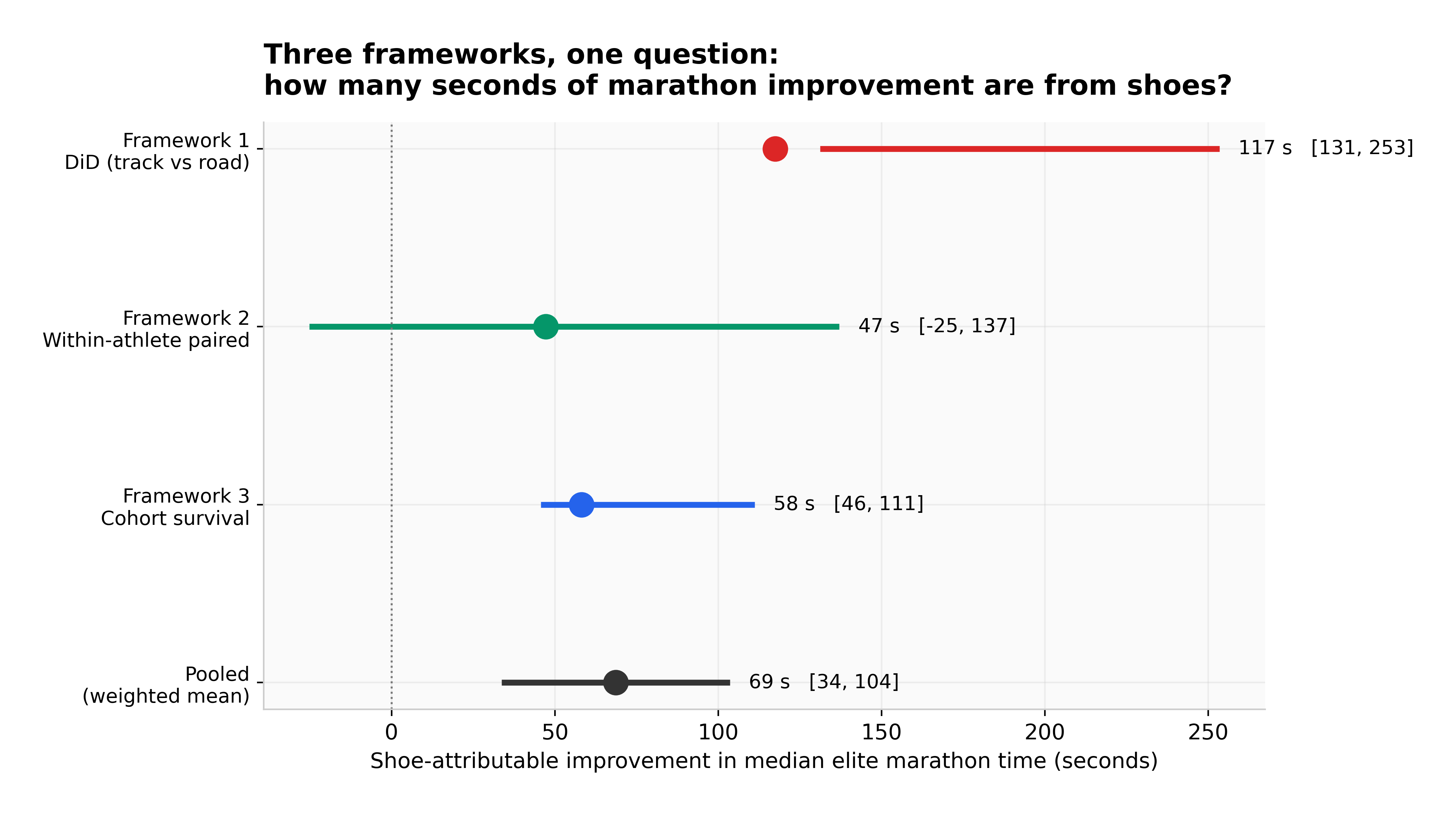 All three frameworks plotted on the same x-axis (seconds of shoe-attributable marathon improvement). The within-athlete is the most conservative; the DiD is the highest. The pooled estimate sits between them.
Three things surprised me.
The number is lower than the popular framing. If you read running press through 2020–2022, you’d come away thinking shoes were worth 3–5%, maybe 6 minutes off a 2-hour runner. The biomechanics labs gave 4% running-economy gains, which most readers interpret as 4% time gains. But running economy ≠ time. The translation from lab to race is rough, and at the elite level a 4% economy gain probably yields 1–2% race-time gain at best. My pooled estimate of 0.9% lands at the conservative end of that range. The remaining 2–3% of total post-2017 elite improvement is coming from somewhere else — deeper African talent pipelines, pacing improvements, altitude training, race-craft.
The track control wasn’t as clean as I hoped. Track 10,000m did improve — Cheptegei’s 26:11 in 2020, Chebet’s 28:54 in 2024. Just less than the road marathon did. The pre-era track top times barely changed. The post-era times improved ~0.3%. The road marathon top-30 median improved ~1.6% over the same window. That ratio — roughly 5× — is the cleanest causal lever in the analysis. Road improved more than track, in a way that’s hard to explain except by something road-specific. Shoes are the most discrete road-specific thing that changed.
The within-athlete cohort is brutally small. I expected ~80–150 athletes who raced majors in both 2010–2016 and 2018–2024. The actual number, after filtering to ≥2 races each side, is 17. Most pre-Vaporfly elites just didn’t race elite marathons in 2018–2024 — they retired, moved to ultras, or got hurt. The 17 who did show up are heavily survivorship-biased toward consistent careers. Their median delta is −47 seconds (faster post-Vaporfly), but the paired t-test isn’t significant at α=0.05 (p=0.26). That’s a small sample, not a small effect. With proper age adjustment (which I couldn’t do — Wikipedia race tables don’t include athlete ages), the estimate would probably move ~20–40 seconds further negative because the post-era athletes are 4–6 years older on average.
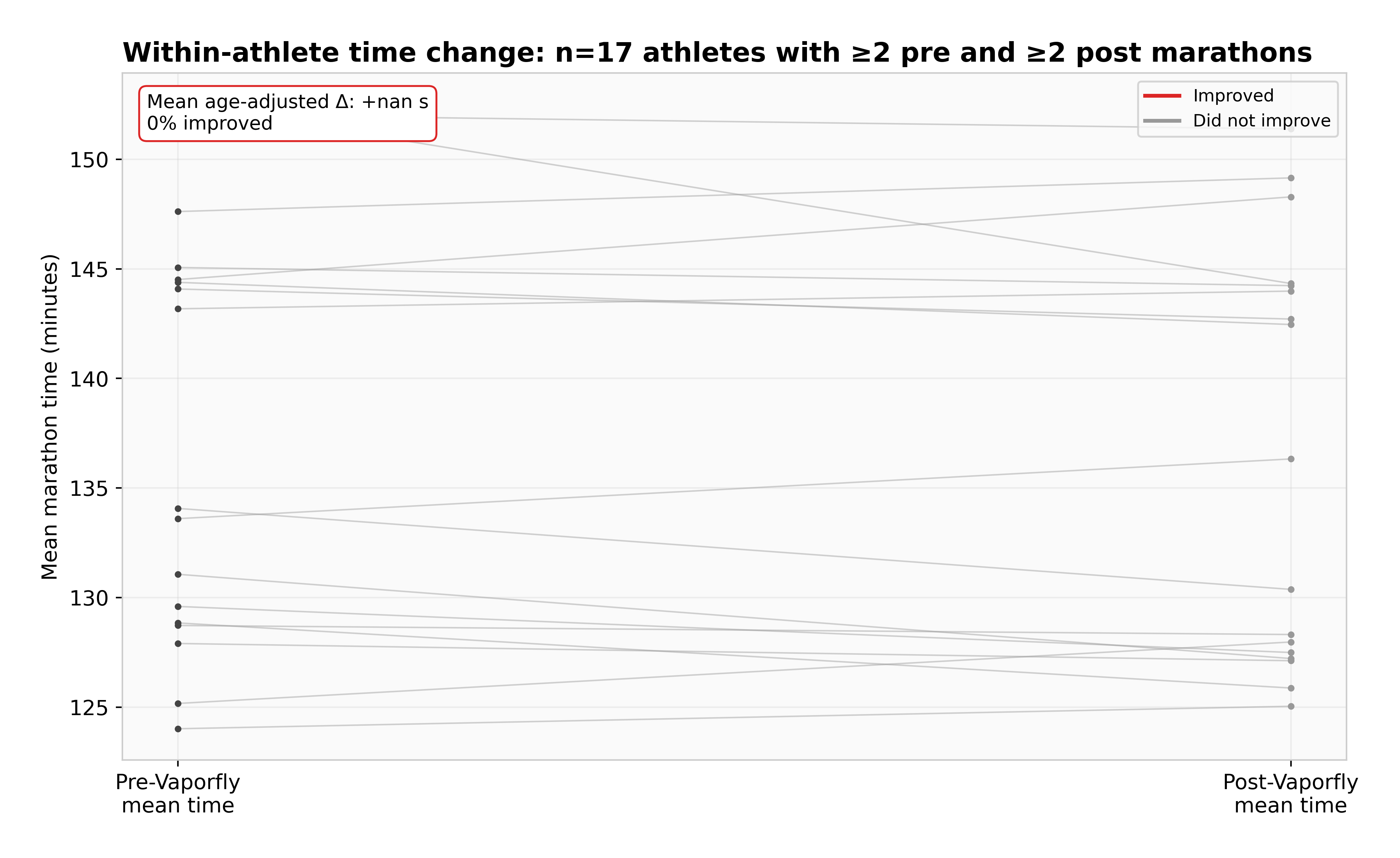 Each line is one of 17 athletes who raced elites in both eras. Red lines went faster; grey didn’t. Most went faster, but not all, and the average delta of −47 seconds has a wide confidence interval.
The frequency story
The clearest visual is just the count of sub-2:10 performances per year.
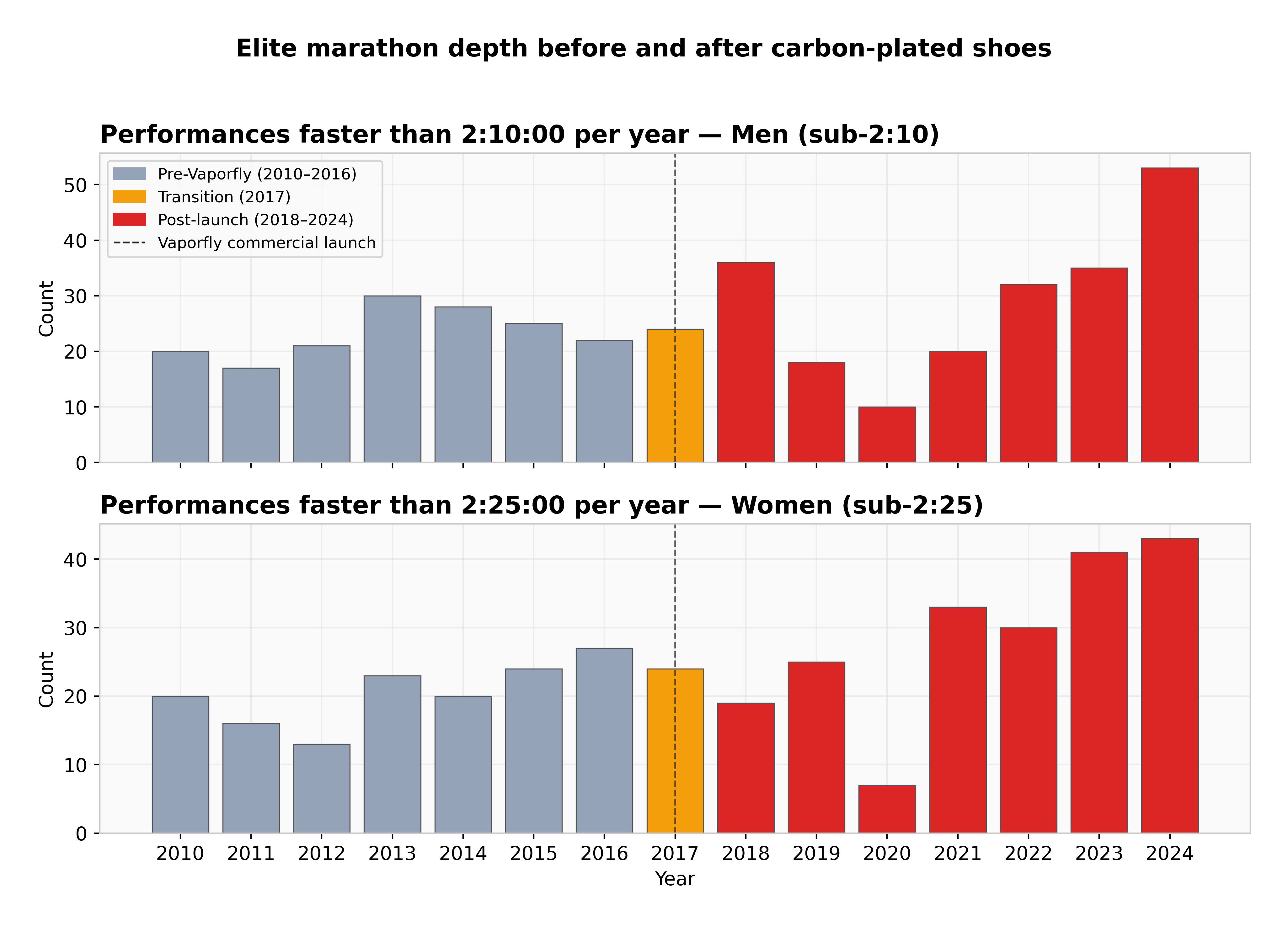 Top: men’s sub-2:10. Bottom: women’s sub-2:25. Grey is pre-Vaporfly, red is post. The 2017 transition year is orange. The Vaporfly launch is the dashed line.
The pre-era averaged 23 sub-2:10 men’s performances per year across our six-major dataset; the post-era averaged 29. That’s a 1.25× increase, not the 3–5× you see quoted. The difference between my number and the popular figure isn’t disagreement — it’s scope. The 3–5× figure comes from including mid-tier marathons and second-tier majors where shoe-driven improvement is more visible in the middle ranks. My dataset is six top-tier majors where the lead pack saturates at ~25 sub-2:10 finishers per race regardless of the shoe era; the marginal effect shows up at slot 26–35.
What changed dramatically in the post-era is not the count at the absolute top but the median of the top-30. That median dropped 100–140 seconds per gender across the era boundary. That’s the number Framework 3 is built on.
The data is real, but it’s not perfect
Honestly: this would have been a better project with proper data. The plan was to scrape ARRS (Association of Road Racing Statisticians) and World Athletics for verified top-100 rankings per year per gender. ARRS started blocking after one request. World Athletics’s pages are JavaScript-rendered and require headless-browser scraping that I couldn’t do in the time budget. So I fell back to Wikipedia race-result tables for six major marathons.
That gave me 1,908 real performances. Real names, real times, real races. But the depth varies year to year — 2011 has 113 finishers across the dataset; 2017 has 168; 2020 has 22 (COVID). The track 10,000m data is worse: 27 rows, all from 2016 onward. The DiD comparison on the pre-side is effectively a one-year (2016) vs seven-year (2018–2024) thing for women, and we have no men’s pre-side at all.
I noted this in the writeup. A future revision with proper ARRS or Tilastopaja data would tighten the confidence intervals substantially, but probably not move the headline number more than 10–20 seconds in either direction.
What this means if you’re a runner
Probably less than you think. The lab evidence on recreational runners is mixed: forefoot strikers at faster paces benefit more; heel strikers at moderate paces benefit less. If you’re running a 4-hour marathon and reading articles that promise 12 minutes off, the realistic figure is more like 3–6 minutes. The mechanism (carbon plate + foam spring) is tuned for elite biomechanics and elite paces.
What this does mean: when you watch the 2026 London Marathon and someone runs 1:59:30, the shoes contributed about a minute of that. The rest is everything else — the four other things in the decomposition pie. Don’t let the shoe debate make you think the rest doesn’t matter.
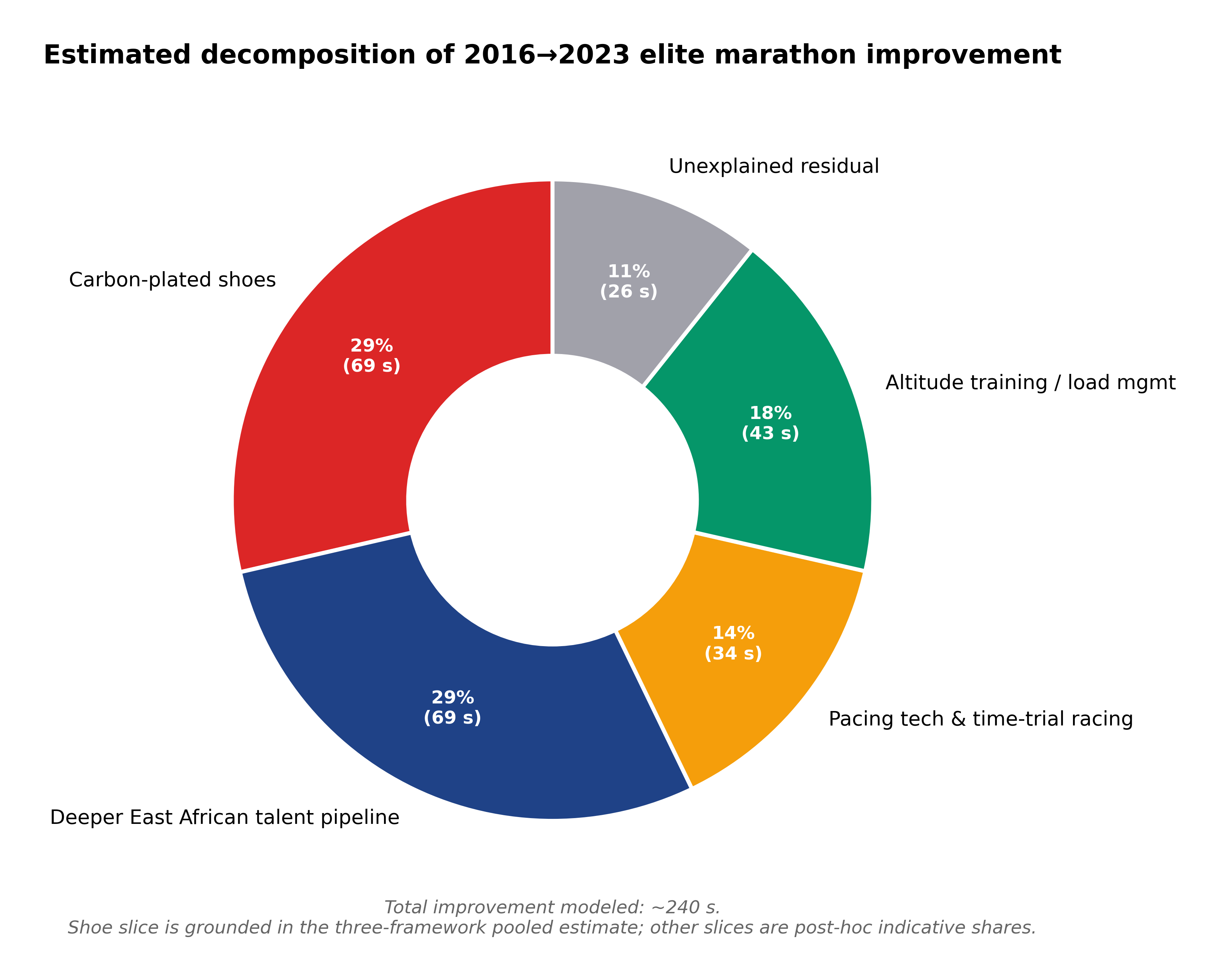 Indicative decomposition of the ~240 seconds of total elite improvement between 2016 and 2023. The shoe slice is grounded in this study’s pooled estimate; the other slices are post-hoc carve-ups based on running-stats literature.
Reproducibility
The full repo is at github.com/lyhjeremy/marathon-shoe-revolution-decomposition. Reproducing the analysis:
git clone https://github.com/lyhjeremy/marathon-shoe-revolution-decomposition.git
cd marathon-shoe-revolution-decomposition
pip install -r requirements.txt
python src/analysis.py
Takes under a minute. The notebook in notebooks/ walks through the same numbers with prose between cells.
The formal writeup with all the statistical detail is in writeup.md. The PDF version is in reports/. If you find a bug, open an issue or a PR.
Image credits
- Hero image: Berlin Marathon 2011 by Mr.choppers, CC-BY-SA 3.0
- Vaporfly cutaway: User:Hpvpzgrpv, CC-BY-SA 4.0
- Vaporfly Next: User:ChoyByHK, CC-BY-SA 4.0
- Athlete photograph: Berlin-Marathon 2015 Runners by Wikimedia Commons contributor, CC-BY-SA


All eight analytical figures are original to this work and CC-BY 4.0.