All-round powerhouses
USA, Great Britain, Netherlands, Italy, Jamaica, Canada. Strong nearly everywhere rather than concentrated anywhere.
Medal tables count the top three and throw away the rest.
A medal count is a very lossy summary of a country's athletics programme: it ignores the depth just behind the podium, which is most of what a programme actually produces. Using World Athletics points as a common currency across 6,400 top performances in 16 events, this builds a country × discipline matrix of athletic capital and then asks what shapes countries come in. The answer is five clean archetypes.
elite performances from 2023–24, each carrying the WA points that make a shot put comparable to a 5000 m.
nations with enough elite depth to profile across five discipline groups.
archetypes out of k-means: all-round powerhouses, distance specialists, throw & jump powers, distance & middle powers, and single-event nations.
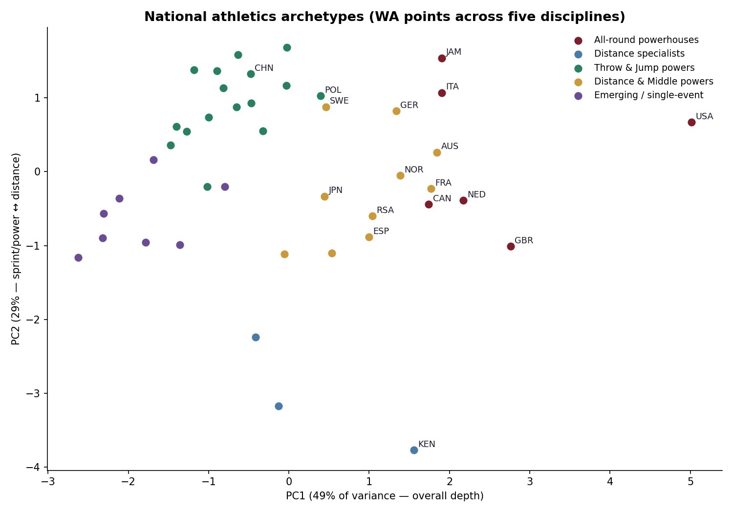
PCA reads cleanly: PC1 is overall depth, PC2 is a sprint/power against distance axis with Kenya at one pole.
Start · the idea
The obstacle to comparing nations across events is that the events do not share units. Seconds, metres and points are not interchangeable, and a country strong in the hammer looks like nothing at all next to a country strong in the 100 m unless you can put both on one scale.
World Athletics already publishes that scale. Every mark in the top lists carries a WA point score designed to be cross-comparable. Whether the tables are perfectly fair is its own question — one I took apart separately in Auditing the Scoring Tables — but as a common currency they are the best available, and they are what the sport itself uses.
↓ the map
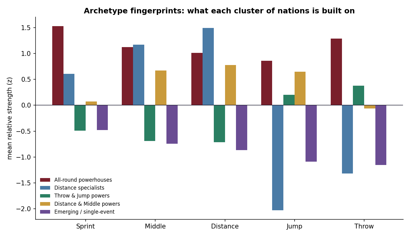
Clustering the 43 nations on their strength across sprints, middle distance, distance, jumps and throws produces five groups that need almost no interpretation:
USA, Great Britain, Netherlands, Italy, Jamaica, Canada. Strong nearly everywhere rather than concentrated anywhere.
Kenya, Uganda, Ireland. Elite at distance and middle distance, and pointedly narrow outside it.
Poland, China, Cuba, Nigeria and others whose strength sits almost entirely in the field events.
Australia, France, Germany, Norway, Japan, Spain. Broad established programmes with an endurance lean.
Strong in one niche — a Bahamas 400 m, a Trinidad sprint — without the breadth behind it yet.
On PC1, overall depth, the USA sits far beyond every other nation. It is not the best of a group, it is its own region of the chart.
↓ the underlying matrix
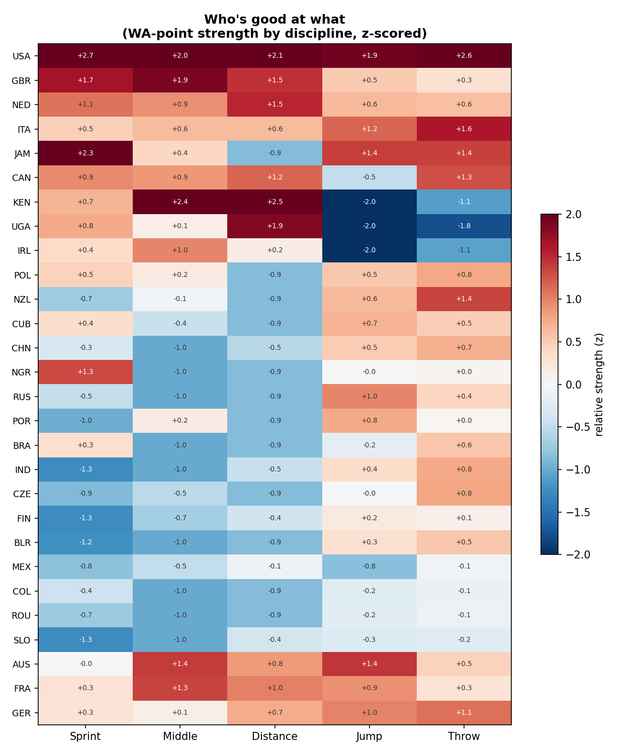
Behind the clusters sits the thing they were computed from: a heatmap of every nation against every discipline group. The specialists are obvious as bright horizontal bands, and the all-rounders as nations with no dark cells at all.
↓ what this cannot tell you
This measures how much elite athletic capital a country has, not how impressive that is given its size or wealth. On an absolute matrix, large populous countries dominate almost by construction. The genuinely interesting per-capita and per-GDP overperformers — Jamaica, Norway — are a natural next layer, and they are not in this version.
Two modelling choices are worth stating plainly. Strength per nation and discipline is the mean of that nation's top-5 WA scores in the group, which is deliberately robust to a single freak performance but also means a country with exactly one world-beater scores modestly. And a nation absent from a discipline entirely is filled to the column minimum before z-scoring, treating absence as no elite presence. That is a defensible reading, but it is an imputation and it shapes the clusters.
A re-fetch of the raw top lists once produced different clustering values than the committed table, and the cause was never isolated. The published numbers are the ones in this repository; that discrepancy is recorded rather than quietly resolved.
Finish · how it was built
national_profiles.csv — every nation's per-discipline strength and archetype