Start · the question
Everyone names a different mile
Ask ten marathon runners where the wall is and you will get mile 18, mile 20, mile 22, and someone insisting it is entirely mental. The disagreement survives because most people only have their own races to go on, and a handful of races is not enough to see a shape.
Boston's timing mats remove the guesswork. Every finisher leaves a cumulative time at 5, 10, 20, 25, 30, 35 and 40 km, plus the finish. Divide each segment by its distance and you have that runner's pace through the race. Do it for the whole field and the average shape of a marathon appears.
↓ the curve
Flat, then a corner
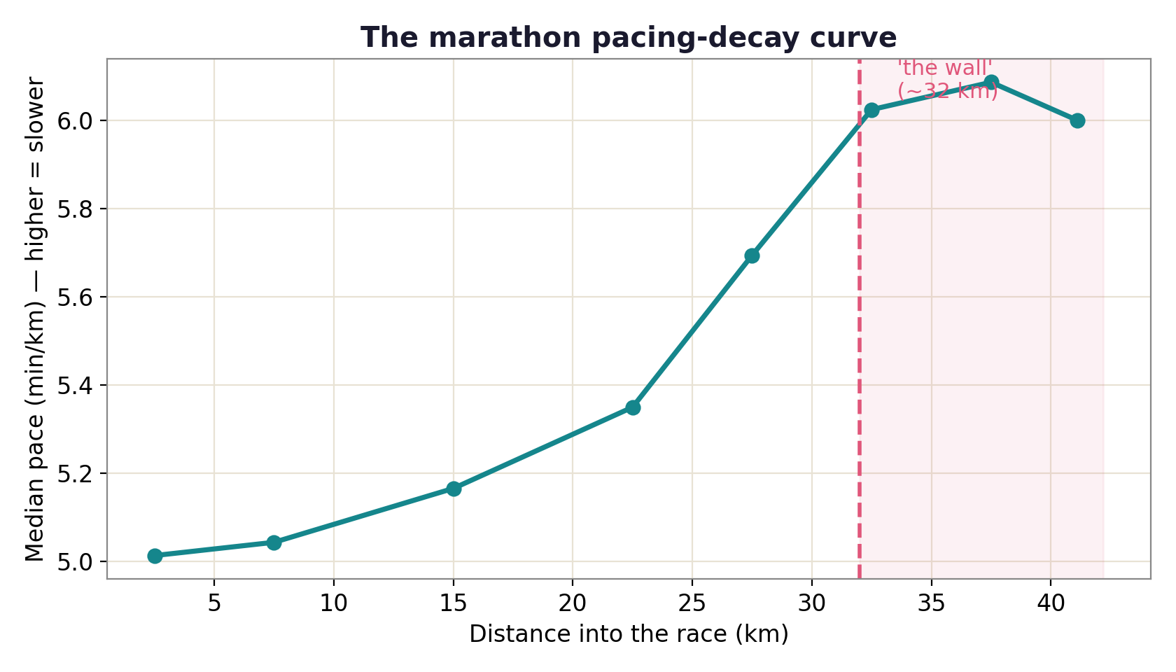
The field's median pace barely moves through the first 20 km. It drifts gently to 25. From 30 km onward it climbs steeply and does not recover. That corner is the thing runners are describing when they say the wall, and it sits in the same place for the field as a whole.
The important detail is that the early part really is flat. This is not a curve that slopes gradually from the gun, which is what you would expect if fatigue simply accumulated. Something changes around 30 km.
↓ who it happens to
The corner is much sharper at the back
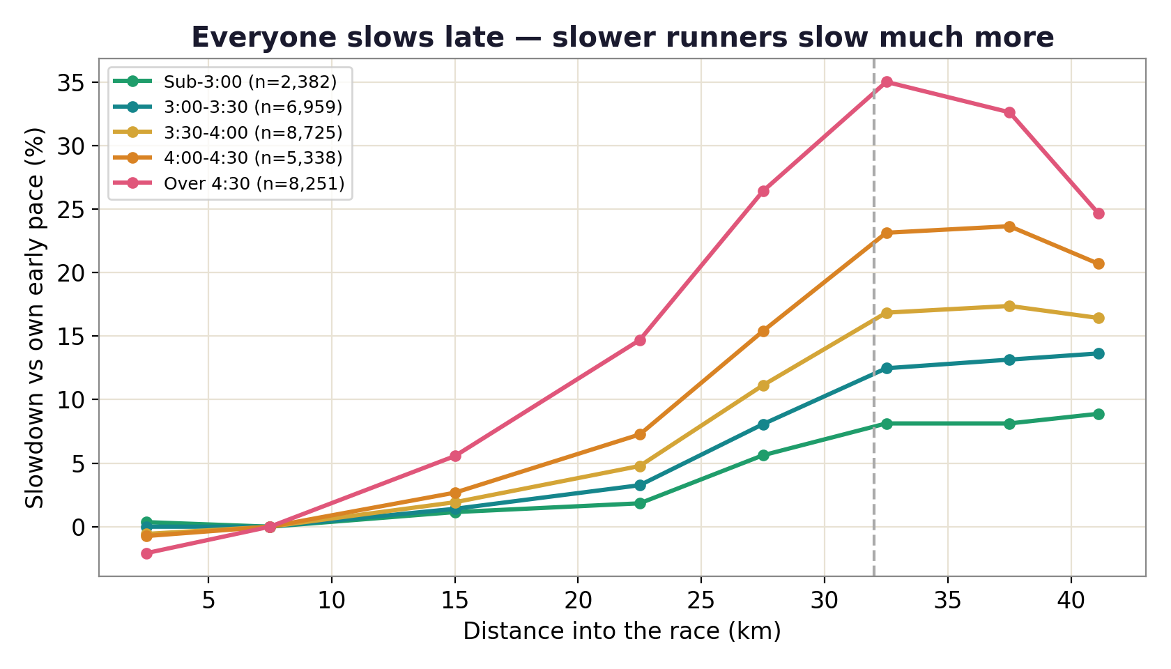
Split the field by finish time and the same curve appears at very different severities. Sub-3-hour runners stay close to flat the whole way. Runners finishing after 4:30 lose 30% or more in the closing segments. The wall is not a binary event that either happens or does not; it is a slope that gets steeper the further back you look.
↓ the spread
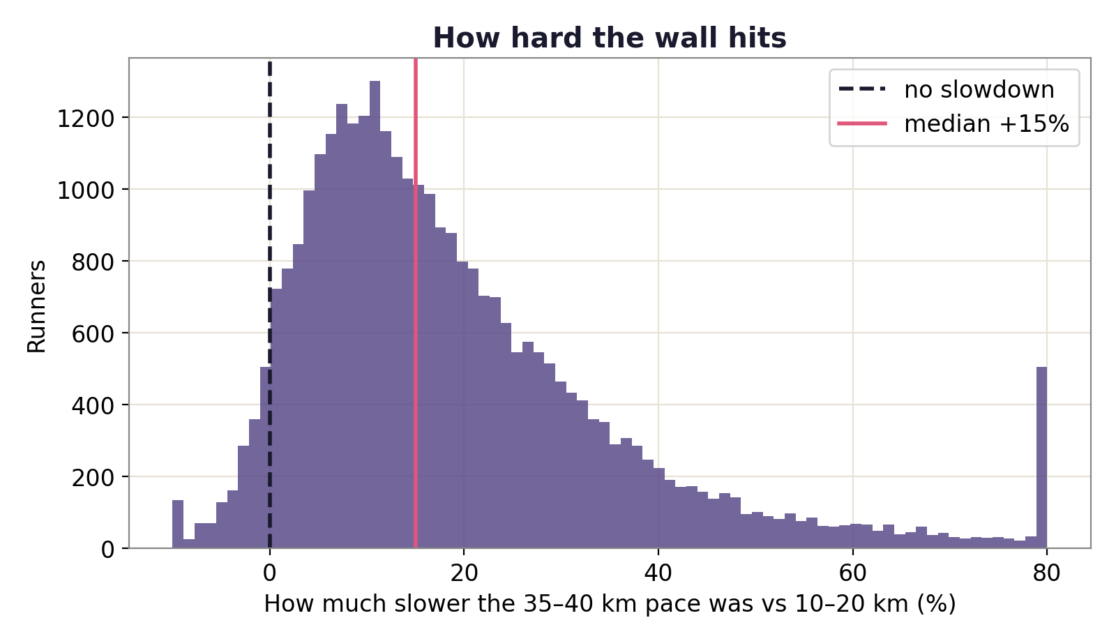
A quarter of the field loses a quarter of its pace
of finishers slowed by more than 25% in the closing kilometres.
The distribution of late slowdown is wide and long-tailed. The median is 15%, but the right tail runs far past it. This matters for how you read the median: it is not that most runners fade a little, it is that a substantial minority fall apart and drag the whole picture with them.
↓ what this cannot tell you
A location, not a cause
This measures where the slowing happens, not why. Glycogen depletion, muscle damage, heat, and simply starting too fast all produce a late-race fade, and split data cannot separate them. Anyone claiming this chart proves a mechanism is reading more into it than is there.
Boston's course is also its own argument. The Newton hills run from roughly 16 to 21 miles, which is 26–34 km, landing squarely on the corner. Some of the sharpness at 30 km is Boston's terrain rather than human physiology. A flat course would likely still show the corner, but softer and perhaps a little later.
And this is one edition of one race. The companion study on negative splits uses the same field, so the two share whatever is peculiar about that day.
↓ so what
The fix happens before 30 km
The flat early section is the part worth staring at. By the time the curve turns, the race has already been decided by choices made in the first two hours. The runners who stay flat late are the ones who were not really at their limit early.
You cannot pace the last 12 km. You can only pace the first 30 and find out what you left yourself.
What the curve is actually sayingFinish · how it was built
Where the numbers come from
Two scripts, fully reproducible. fetch_data.py downloads the
results, analyze.py writes every figure and both tables here.
Raw data is git-ignored; the outputs are committed.
- Data
- Official 2014 Boston Marathon results, via the public llimllib/bostonmarathon mirror
- Sample
- 31,655 finishers with a complete set of 5 km splits
- Splits
- Cumulative times at 5, 10, 20, 25, 30, 35, 40 km and finish; segment pace = time ÷ distance
- Late slowdown
- 35–40 km pace measured against that same runner's 10–20 km pace
- Built with
- Python, pandas, matplotlib
- Companion study
- The Negative-Split Myth, on the same field split in two halves