Start · the question
Two questions that are really one
"Where does my time sit?" and "how superhuman is the record?" are usually asked separately, and both get answered with adjectives. Put on the same axis they answer each other: your time is a point on a curve, and the record is another point on the same curve, a very long way along it.
Boston 2014 supplies the curve. It is the largest clean, public marathon field available, with a real distribution rather than a summary.
↓ the curve
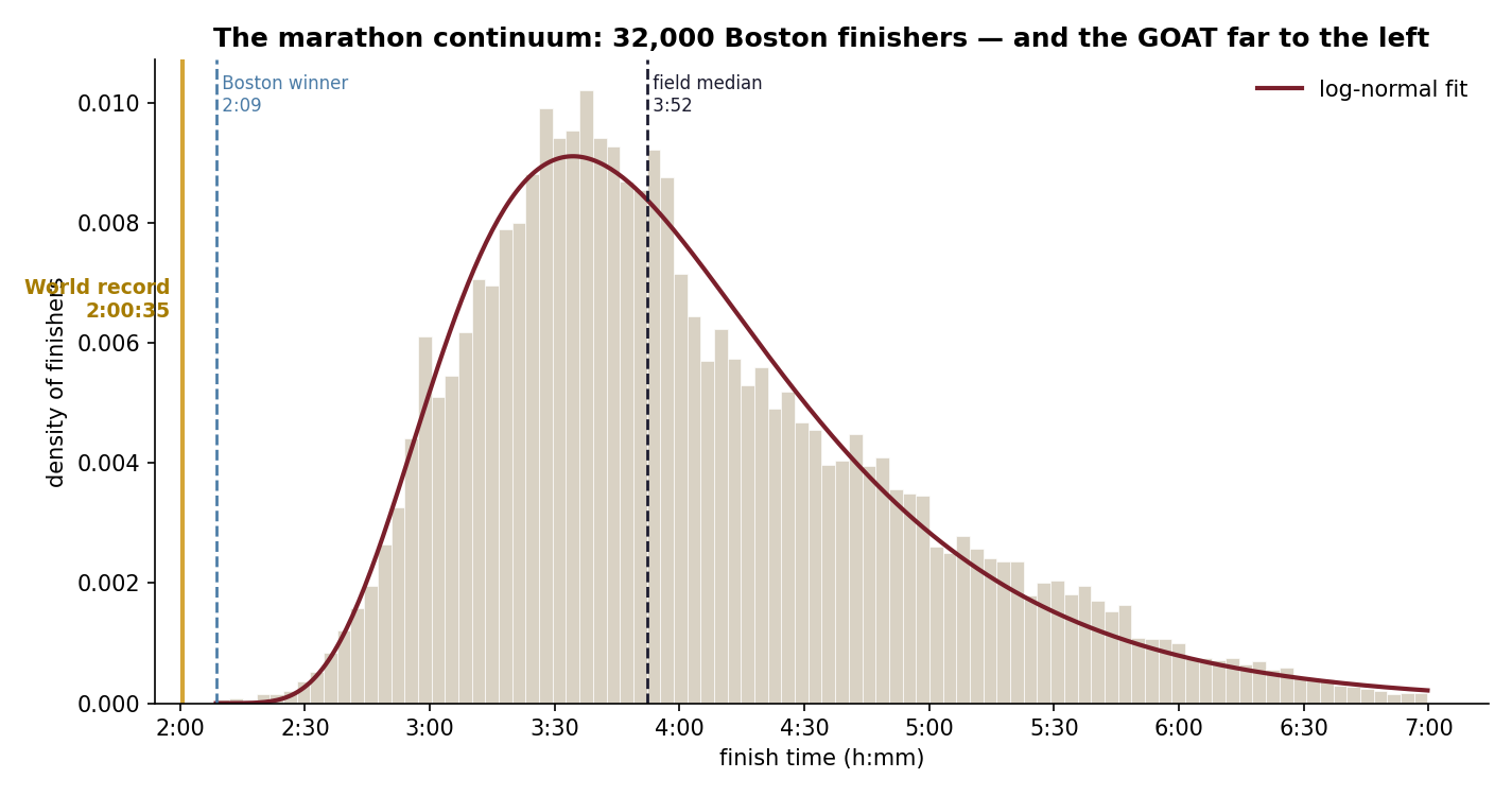
A marathon field is log-normal
Fitted, the field is a textbook log-normal: a median of 3:52, a mean pulled later to 4:03 by the slow side, and a long right tail out past seven hours. That asymmetry is not noise, it is what a field looks like — you can be very much slower than the middle, but only so much faster.
Mark the world record on the same axis and it does not sit at the sharp end of the curve. It sits off it.
↓ the elite edge
The fast tail has a wall at the end of it
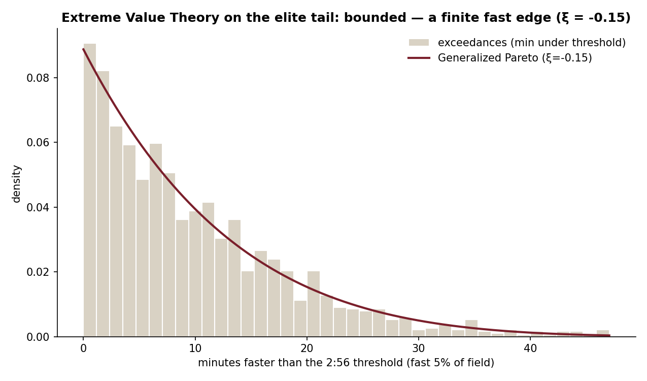
Peaks-Over-Threshold GPD shape parameter, fitted on the fastest 5%.
A negative shape parameter is the interesting result. It means the tail is bounded: performance does not extend indefinitely into the fast direction but runs into a finite edge. That is consistent with a hard human ceiling, which is what most people assume but rarely test.
What it deliberately does not do is name the ceiling. Peaks-Over-Threshold can identify that a bound exists far more reliably than it can say where the bound is, so the shape is reported and the point estimate is not.
↓ your race
Where any given time lands
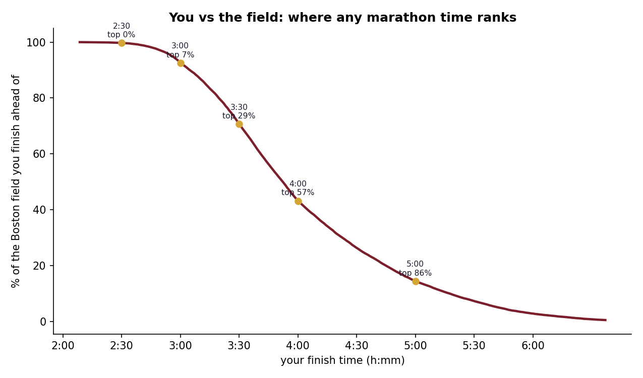
The practical output is a lookup. A 3:00 marathon beats
about 93% of this field. A 4:00 sits right
at the median. Every level's gap to the record is tabulated in
you_vs_goat.csv, because the second number is the one that
makes the first one mean something.
↓ the caveat that matters most
Boston is a qualifying race
This is not the general public. Every runner in this distribution had to post a qualifying time to be here, so the whole curve is shifted fast relative to a typical big-city marathon. When the page says a 3:00 beats 93% of the field, it means this field, and says so.
The direction of the bias is worth noting: a general-entry race would sit slower, which would make the record look more extreme, not less. The caveat cuts against the headline being overstated, not for it.
One number is also withheld on purpose. The record's rarity as a "1 in N" figure would require trusting the fitted density far past where any data supports it, so the record is described empirically instead: faster than everyone, 2.4 SD out.
Finish · how it was built
Where the numbers come from
- Data
- Boston 2014 finishers via the public llimllib/bostonmarathon mirror, cleaned to runners with plausible times
- Sample
- 31,842 finishers
- Body fit
- Log-normal, fitted to the full field
- Tail
- Peaks-Over-Threshold generalised Pareto on the fastest 5%
- Reported
- Tail shape ξ, not an estimated fastest-possible time, which POT cannot pin down
- Built with
- Python, pandas, scipy, matplotlib